- In addition to a revised logo that drops the apostrophe from Papa John’s, the chain will offer a new open floor plan for its restaurants and easier pick-up options.
- John Schnatter, the chain’s founder who was given the boot in 2018, criticized the logo change as “irrelevant,” adding, “They can’t have Papa Johns without Papa John.”
Related: Papa John’s closes largest franchisee development deal in its history
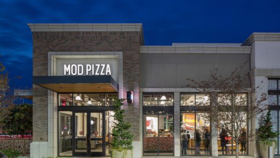
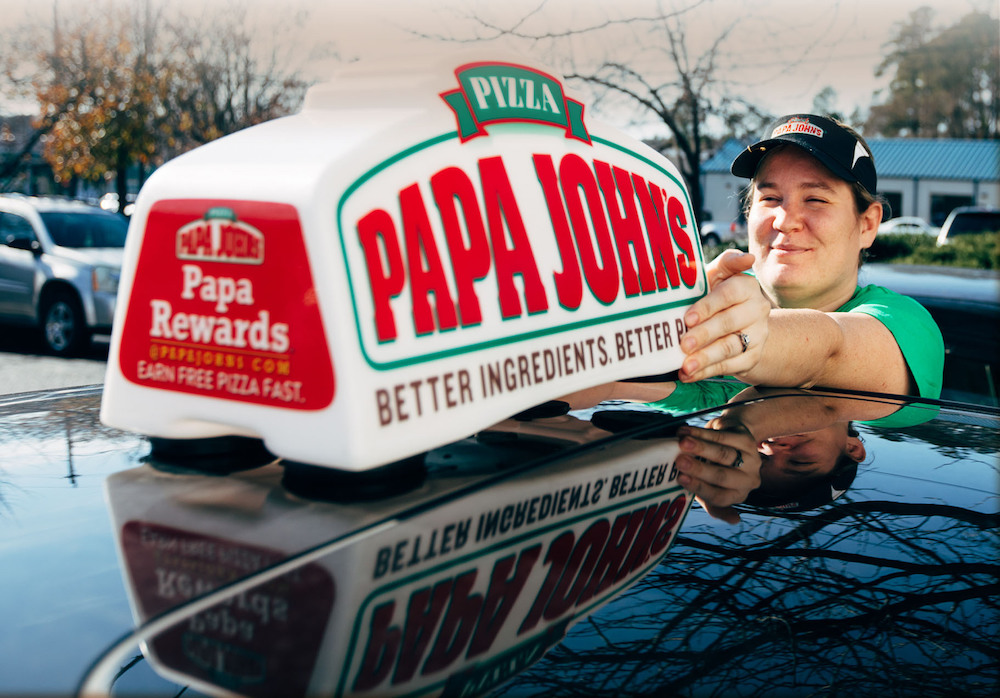
Say goodbye to the apostrophe in the Papa Johns name and hello to a new look and feel for the rebounding pizza chain.
Papa Johns—formerly called Papa John’s—announced that it is reinventing and modernizing itself with a new restaurant design, logo and overall brand identity.
The pizza chain has experienced remarkable same-store sales growth since the pandemic began, although its comeback started even before then, after the ousting of controversial founder John Schnatter in 2018 and Rob Lynch’s rise to the CEO position.
“The loyalty and love people have for Papa Johns has been built on our well-known promise of ‘Better Ingredients. Better Pizza,’” said Max Wetzel, the company’s chief commercial officer, in a press release on November 16. “Today, we are signaling to the world that Papa Johns is ‘Hungry for Better.’”
“We are evolving how the Papa Johns experience comes to life across all touchpoints, while remaining true to what got us where we are today and bringing to life our continued aspirations to improve and grow,” Wetzel added. “This new experience is both a celebration of our tremendous momentum and a vision to inspire future growth.”
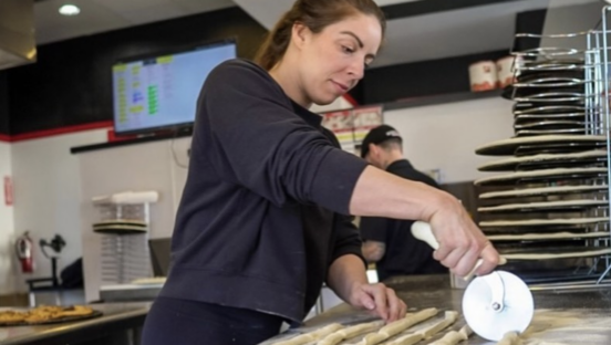
Papa Johns’ new streamlined, flexible environment will provide “seamless” purchasing and pick-up experiences for customers, the company said. A new open-floor-plan restaurant design “blends modern simplicity with the warmth of the experience that invites people to enjoy pizza. Through handcrafted, personalized details, customers will be surrounded by premium ingredients and delicious food in a modern, inviting atmosphere.”
The redesign is expected to provide customers with better pick-up options via drive-thru ordering and a Drive-Up Pick-Up lane and at the pick-up counter, which now includes a self-service option so customers don’t have to wait in line.

“Papa Johns team members will prepare orders at modular stations that allow the same space to be used for different products at different times,” the company said. “As they cut pizzas and place the iconic pepperoncini pepper and Papa Johns Garlic Sauce cup inside each box, they will be better equipped with a special space to add these final touches so well-loved by customers.”
The chain’s new logo features updated hues of the company’s signature red and green colors “to better distinguish the brand wherever it is seen—both online and in person.” A custom font, with a bulge in the middle, was developed to signify the stretching of dough.
Notably missing from the logo is an apostrophe—the company is no longer Papa John’s, but, rather, Papa Johns. Does the change also trumpet the fact that Papa John’s no longer belongs to Papa John Schnatter himself?
The company has made no such suggestion, but it’s easy to interpret it that way. Schnatter, who has repeatedly bashed his former company since he was removed as chairman and CEO after reportedly uttering a racial slur on a company phone call, still hasn’t let go. In a November 3 interview with Bloomberg Businessweek, he described his ouster as “a crucifixion” that was “unethical,” “immoral” and “evil.”
On Tuesday, as news broke about Papa Johns’ rebrand, Schnatter released a lengthy statement about it, saying he is “especially hopeful for the continued success of the franchisees, most of whom I know very well.”
“My criticism of company management over the past three years has rested largely on their refusal to admit they were wrong about the false media narrative about me and my legacy, and their failure to maintain a commitment to the principles on which we built the company brand, including consistent product quality with every single pizza made,” Schnatter asserted.

He also hinted that the company still needs him, despite its dramatic post-Schnatter growth and menu innovation. And it’s clear he’s not happy with the loss of the apostrophe in the company’s name. “Considering the enduring association of Papa John with the brand, the company’s change to the brand logo today is misplaced. Instead of being obsessed with Papa John and irrelevant changes to the brand logo, the company should become obsessed once again with making quality Papa John’s pizza consistently. Try as they may, they can’t have Papa Johns without Papa John.”
In August of 2020, Papa Johns reported a record-breaking 28% increase in sales during the second quarter, noting that its margins and profits were “the highest they have been in several years” while unit closures were at their lowest in a decade. For the third quarter, same-store sales growth slowed but were still 6.9% higher than the previous quarter, even while Domino’s posted a decrease of 1.9% and Pizza Hut’s same-store sales grew by just 2% compared to 4% and 16% growth in the prior two quarters.
At one point shortly after Schnatter’s removal as chairman and CEO, the company had to cut royalties, foodservice prices and other fees for its North American franchisees, who were facing lower sales. Schnatter had stirred up controversy by blaming his company’s declining sales on NFL players who were kneeling during the national anthem in protest of police brutality—Papa Johns was an official NFL sponsor at the time and advertised heavily during televised football games.